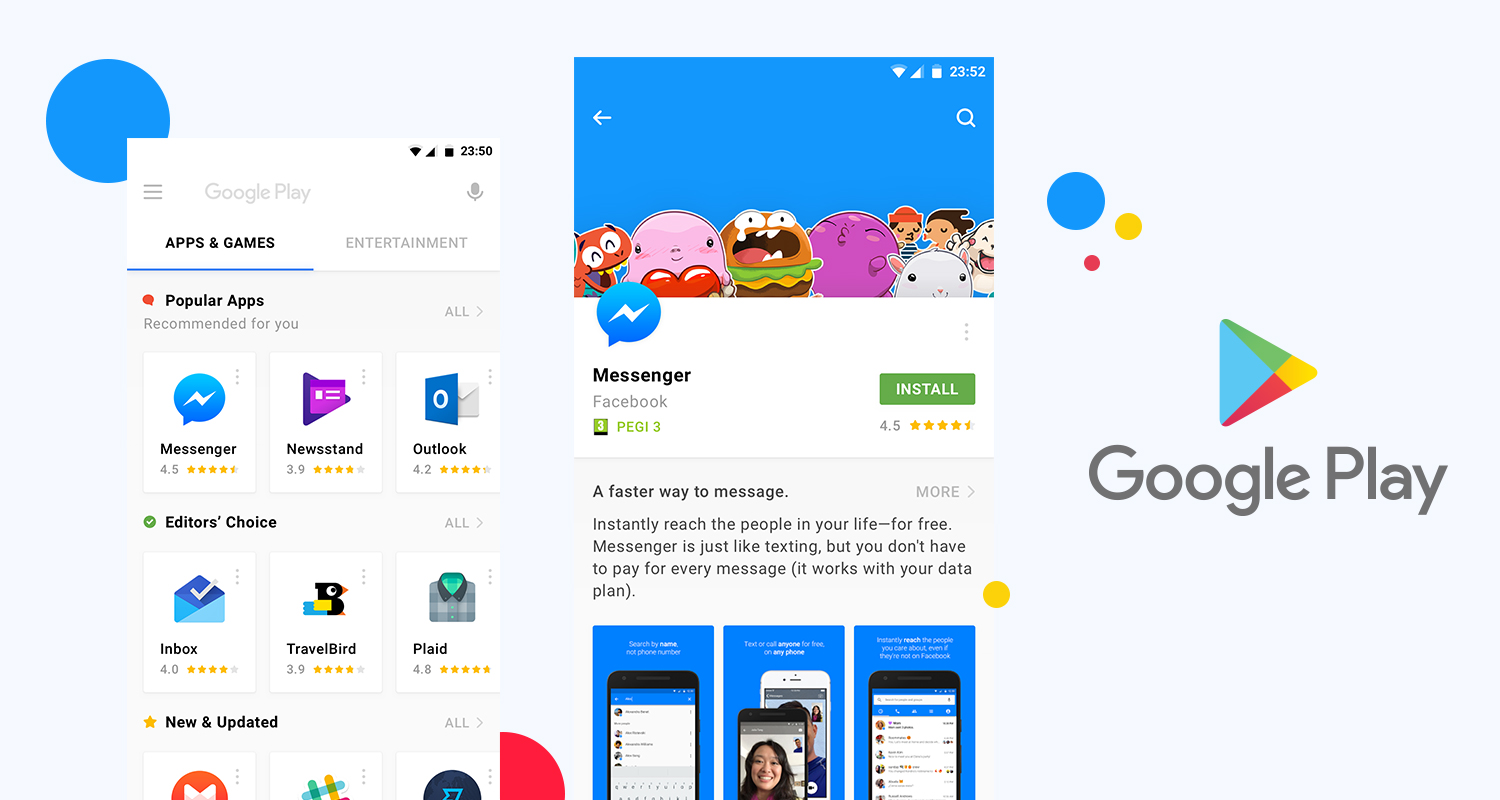
Google added New Playstore Redesign to improve the way users manage their apps. In the latest revamp it got rid of the hamburger menu. And moved most of its menu entry to the account switcher in the top right corner. With many more improvements and changes still in the pipeline.
Screenshots of a revamped “My Apps” section surfaced last month. And the new layout is starting to appear for more users. In the “My apps & games” section of the Play Store, you normally see a collection of pending updates and most recently updated apps in the first tab — it’s a useful overview for those of us who still like to read changelogs if they even exist for any of the apps you use.
New Playstore Redesign
A Redditor shared images of a new “Manage apps & device” section replacing the standard “My apps & games” page. It loses most of the tabs available in the old interface, like Updates, Installed, Library, Share, and Beta, instead only giving you two sections — Overview and Manage.
If you just want to check for updates real quick, the new default Overview page is pretty useless. It only lists a few menu entries and stats about Play Protect, used storage, your ratings and reviews, and options to share apps (useful for those living in markets with limited access to high-speed internet).
App updates are just another small menu entry here, with the Play Store telling you that “All apps are up to date.” There’s an option to see details for pending updates, along with an “Update All.” button. Once you update your list of apps, a “See recent updates” button appears in its place, though it now redirects you to the Manage tab.
So head over to the PlayStore and check out if you have got the latest tabs under the hood. If you do then don’t forget to comment below with your opinion.

