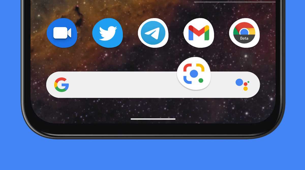
In the coming days, you might see a lot of changes coming to your Android One devices such as the Bottom of the screen Google Search bar for quick searches. This is because the increasingly large smartphone screens make it more convenient to have it there when using the device one-handed.
It looks like Google is testing something out to that effect as some users are reporting seeing the search bar at the bottom of the screen. This is something similar to what they did with the Pixel Launcher years ago.
The Google app now has placed the Search bar underneath the company logo/daily Doodle at the top of the screen. Some users are now seeing the field appear just above the bottom bar in a rather busy design.
Bottom of the screen Google Search
According to the Google News Telegram channel, a redesigned search bar has started showing up for some users on the latest Google app beta release.
This move allows easy access to the search bar on ever-growing screen sizes. However, it comes at the expense of a very cluttered bottom bar. But people have been trying to solve the large screen problems in the past with widgets and other tools, so it is a viable move from the company.
In the dark theme screenshots, we see how the search bar is not exactly attached to the bottom bar, but rather part of a new background layer. There’s already a “Search” tab that opens the keyboard immediately, but Google needs to have its iconic field always visible.

